
Polidea rebranding
-
Polidea’s rebranding was essential to better reflect our role in the tech industry and stand out from competitors across all platforms, from social media to print. We wanted an identity that showcases our design and tech expertise while staying current with trends. This rebrand helps us connect with the clients and candidates we want to attract, positioning us as agile, business-focused experts.
The new brand also strengthens internal pride and alignment, ensuring our team identifies with it. With clear brand guidelines, we maintain consistency in how we communicate visually and message-wise, attracting the right partners who share our values of agility, expertise, and innovation in design and tech.
-
Actively participated in the entire Rebranding process, encompassing brand audit, ideation, art direction, execution, and implementation, all aligned with the company's business objectives.
BrandingBranding
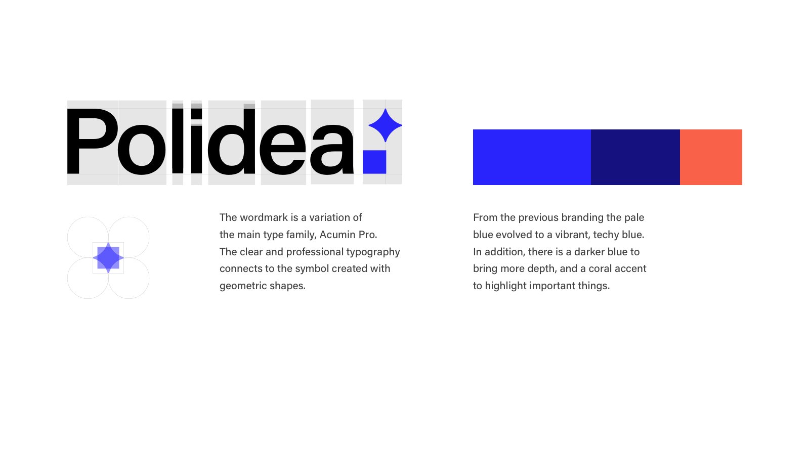
Presentation slide explaining brand Polidea, with text about the logo, color palette, and design principles, including a blue star symbol, blue color swatches, and descriptive paragraphs.

A transparent glass bottle with a wooden cap, set against a blue background with abstract shapes and star-like highlights.
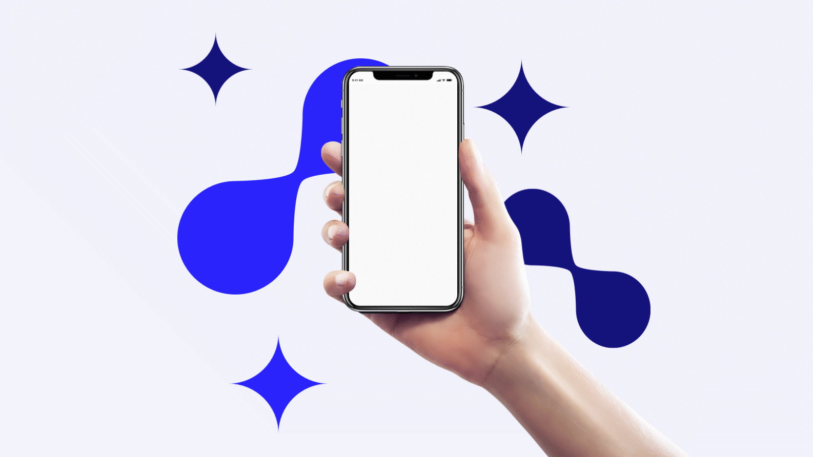
A hand holding a smartphone with a blank white screen, with blue abstract background and star-shaped design elements.
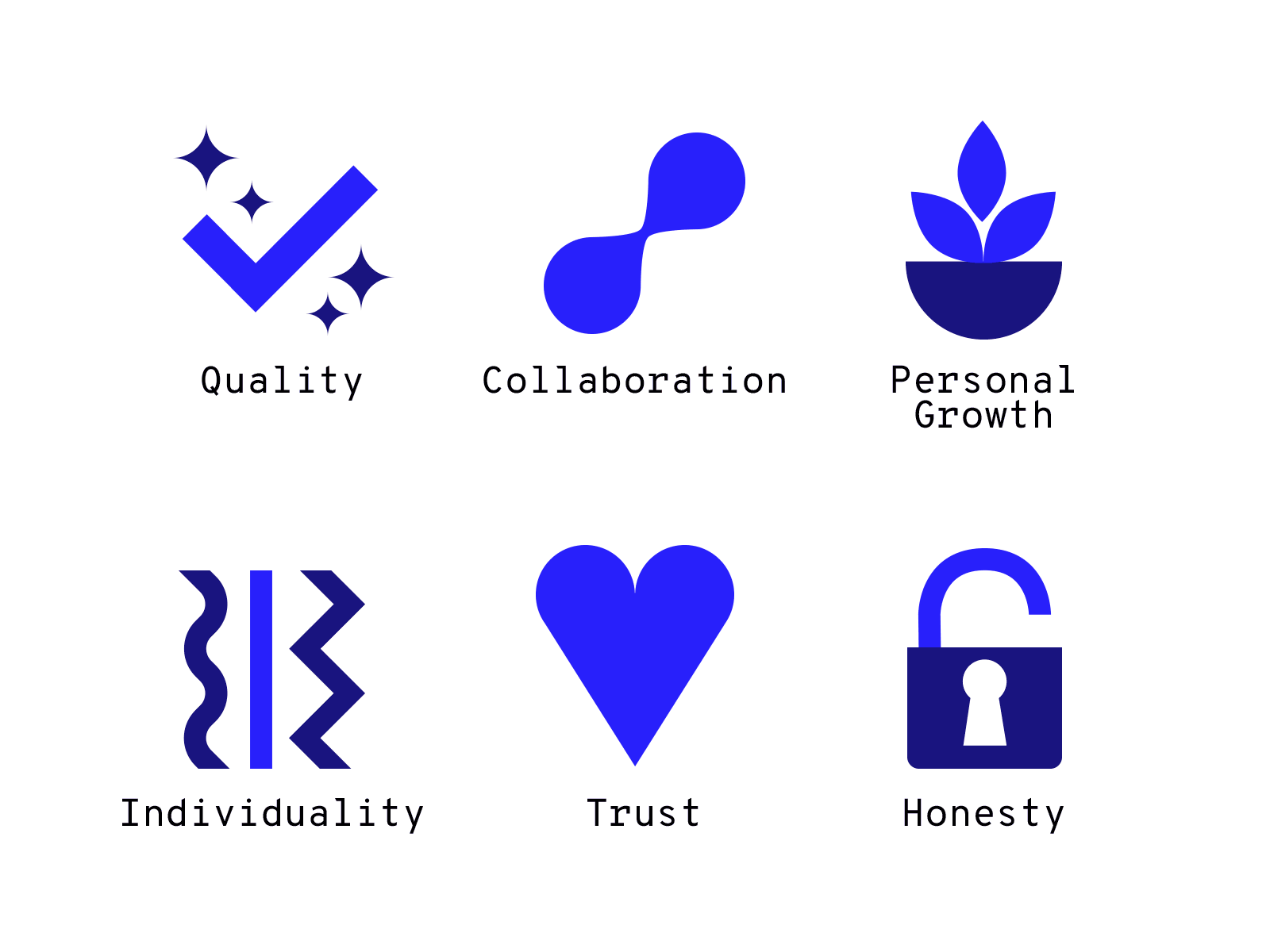
Polidea's values icons
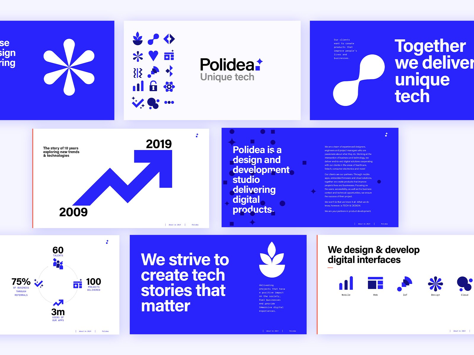
A series of slides and graphics related to Polidea, a technology and digital product design company, featuring blue and white color schemes, with graphs, icons, and text emphasizing innovation, digital experiences, and company milestones.
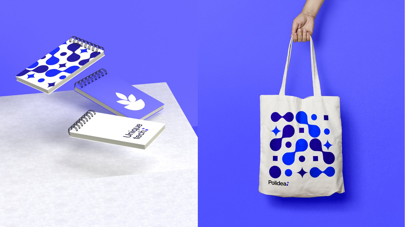
Collection of notebooks with geometric patterns and one with 'Unique tech.' text on a white surface, and a white tote bag with a blue geometric pattern and 'Polidea' logo on a blue background.
A screen showing various blue icons for settings and features on a light background, arranged in a grid.
Brandbook
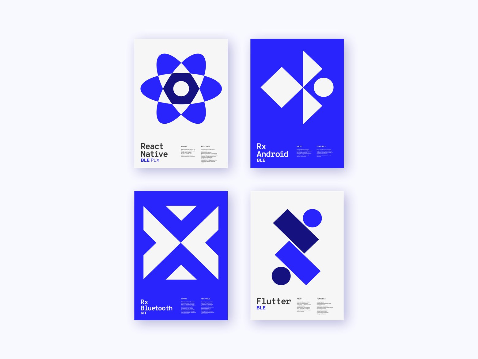
Four posters with abstract blue and white geometric designs and text about technology frameworks and tools. Top left: React Native, BLE. Top right: Rx Android, BLE. Bottom left: Rx Bluetooth kit, blue and white design. Bottom right: Flutter, blue and white design.

A collage of branding and design presentation slides featuring the logo 'Polidea' in blue and black, various charts, diagrams, typography samples, and imagery related to graphical and branding concepts.
Utilo
-
Design the visual identity for Polidea’s in house design studio “Utilo”
-
Collaborating with the design team and UX deciding visual direction, naming and one
Initial visual explorations
UX/UI

A person wearing a suit and glasses, standing in front of a bar with glasses and bottles.
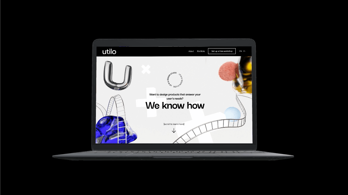
Laptop displaying a creative website with abstract shapes, a large silver letter 'U', and the text 'We know how' in bold.

A chart displaying colors and icons used in a design or presentation, with color swatches and various icon symbols including speech bubbles, question marks, people, and arrows.

Abstract 3D rendered image with metallic letter 'U', pink fluffy ball, yellow and blue ice cubes, and a curved filmstrip on a white background.

Comparison of two fonts, Darker Grotesque and Chakra Petch, with sample alphabets in uppercase and lowercase, including accented characters.

Black illustration of four cats sitting side by side, with the silhouettes of the cats and their tails forming a pattern.
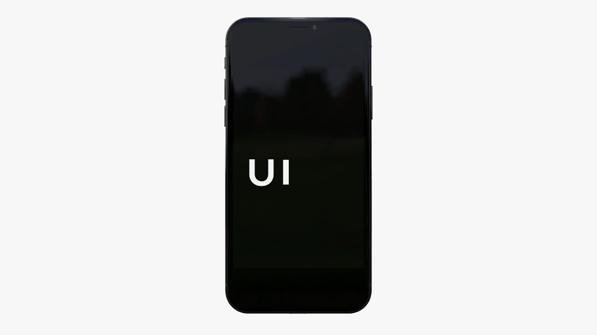
Smartphone screen displaying the letters 'UI' on a black background.

Three posters on a gray textured wall. The left poster shows a blue abstract shape on a white background. The middle poster features white text on a black background that reads, "Ignore design that ignores people." The right poster displays a red circular pattern on a white background.

Three white circles overlapping in a triangle formation on a black background.
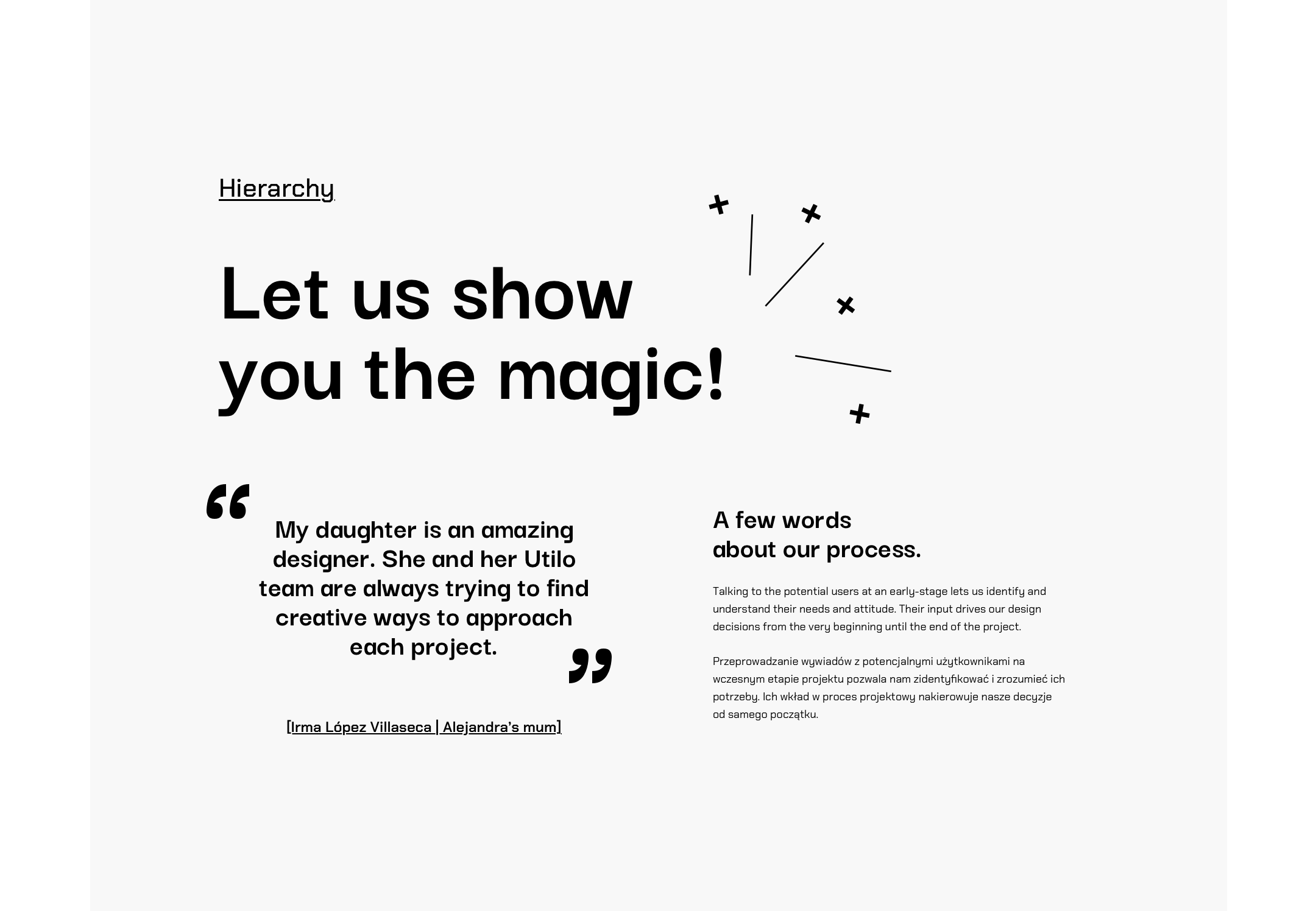
A webpage with a bold headline that says 'Let us show you the magic!' and a designed layout containing quotes, text sections, and abstract decorative elements.
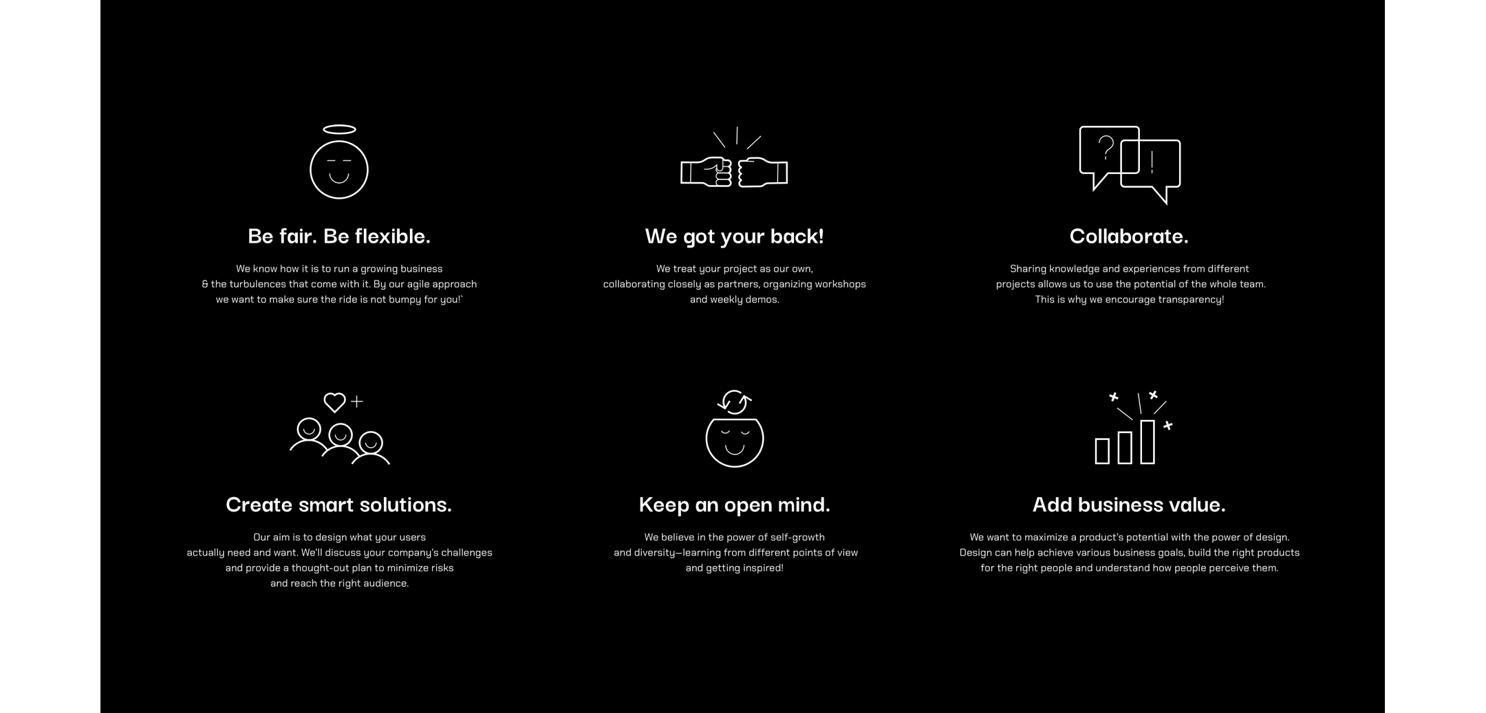
A digital infographic with six sections, each containing an icon and accompanying text about business practices such as fairness, teamwork, collaboration, smart solutions, open-mindedness, and value addition on a black background.

Colorful glass objects, one blue and one yellow, placed on a white surface with business cards and black tags with the brand name 'utilo'.


