R3 Worldwide Revamp
Scope
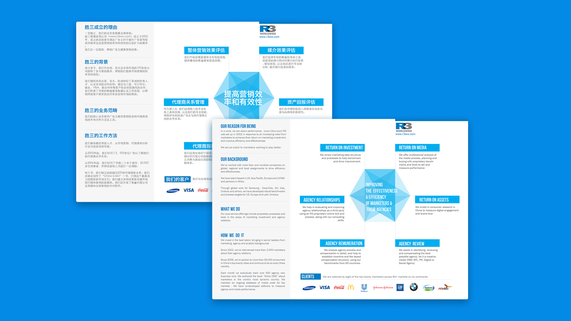
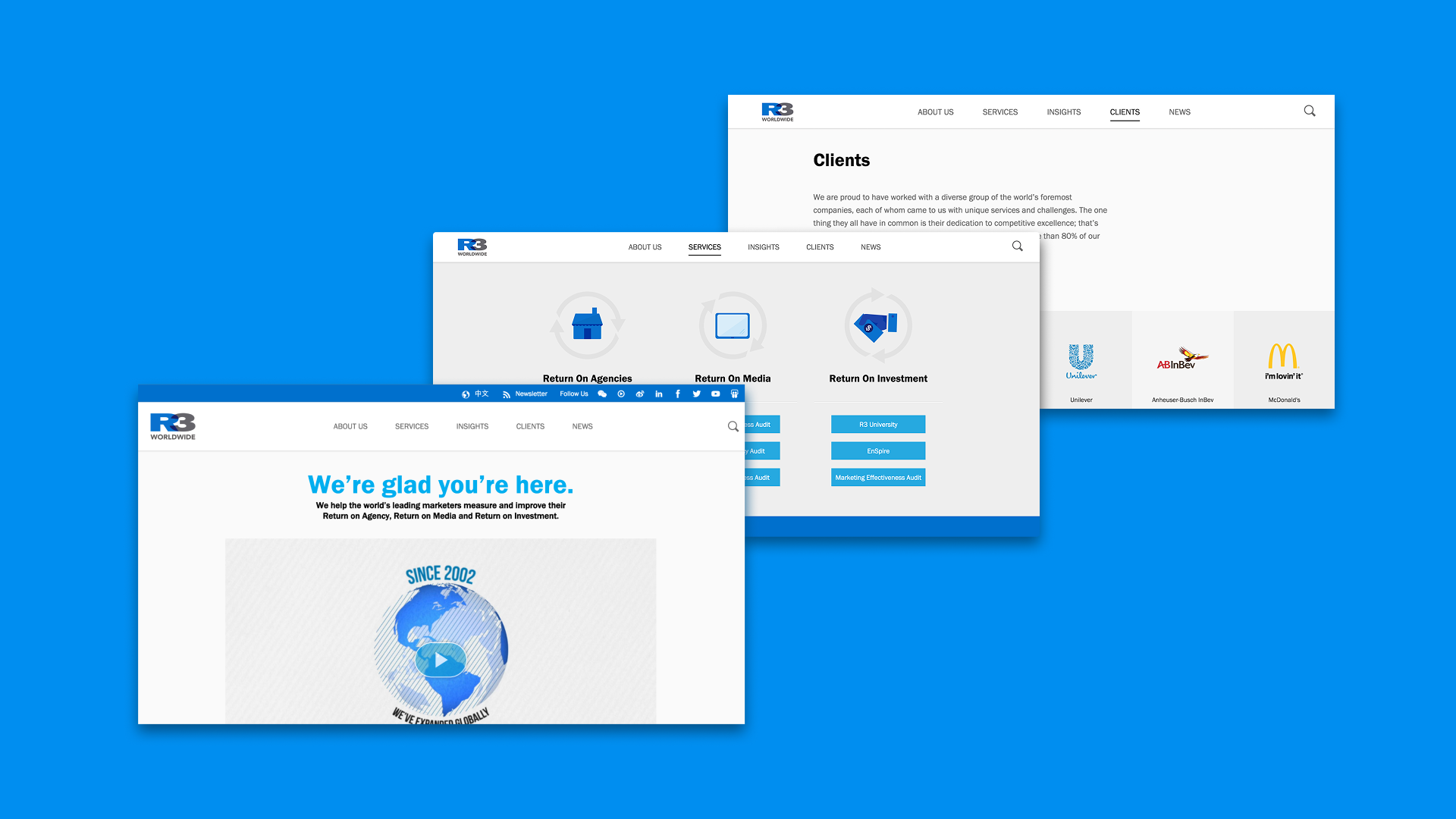
The rebrand aimed to modernize an outdated visual identity, transforming it from a dated, cluttered aesthetic into a clean, contemporary design. This comprehensive update covered everything from the website to stationery and marketing materials, ensuring a consistent and professional look across all touchpoints. Given the bilingual nature of the content (Chinese and English), a key focus was improving readability and navigation, making it easier for users to engage with the information seamlessly.
To future-proof the brand, we introduced a refined typographical system and adaptable design templates that maintain consistency while allowing flexibility for future use. The goal was not just to refresh the brand visually but to create a design system that could evolve over time—elevating it from a "Windows 95" feel to a sleek, modern aesthetic suited for today's digital and print environments.
My role
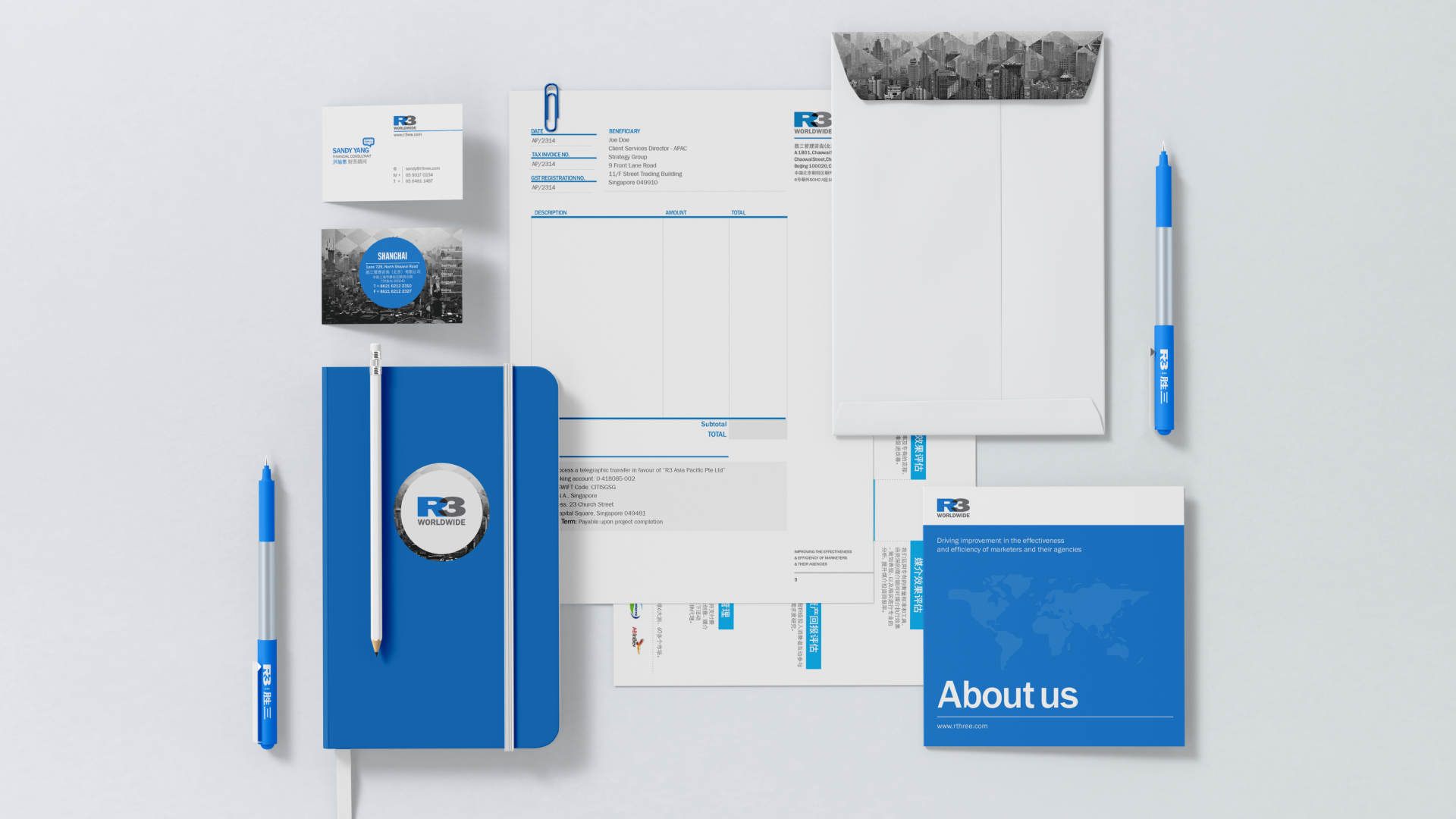
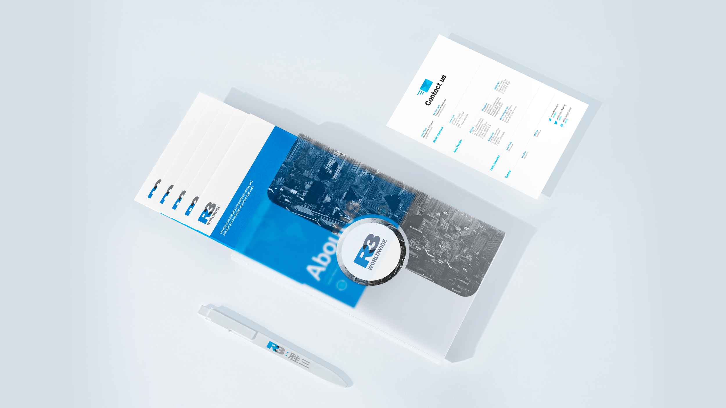
As the sole in-house designer, the first step was conducting a thorough audit of all existing materials to identify areas for improvement and ensure a cohesive, modernized brand identity. This involved refining key assets such as presentation decks, one-pagers, informative brochures, and business stationery, making them more visually engaging and user-friendly. The redesign also prioritized readability and structure, particularly for bilingual content, to enhance clarity and accessibility.
Beyond revamping existing materials, the rebrand extended to creating fresh marketing collateral for clients, as well as designing branded merchandise for company initiatives. This included swag for new employees and company trips, reinforcing brand identity and fostering a sense of community.